Stacksi
Setting up an AI-powered startup for scalability and success
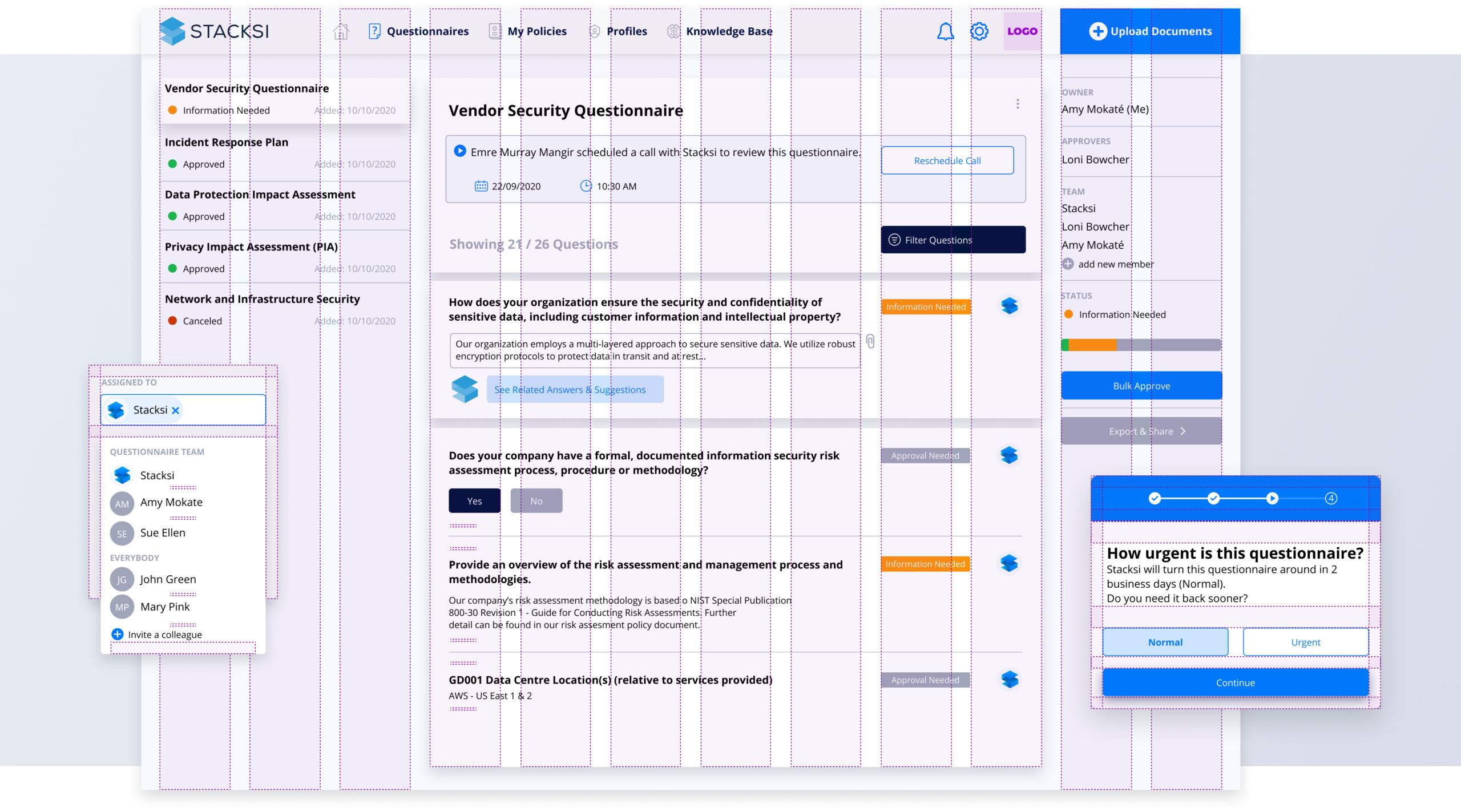
The challenge
Designing a multi-product design system for a fast growing B2B company and their ever-expanding customer base and suite of products.
Establishing the design foundations
My initial undertaking involved transforming preliminary product sketches into a structured visual design framework using design tokens.
To commence this process, I initiated the development of a core set of color fundamentals rooted in the brand palette. This involved extending each color to encompass variations with lighter and darker shades, taking into consideration diverse interaction states and the wide array of use cases. With the color fundamentals in place, I proceeded to formulate semantic palettes tailored to specific purposes, such as foreground, background, borders, and more. Subsequently, I delved into the definition of various other design tokens, covering aspects like grids, sizing, spacing, shadows, borders, and radii.
Developing the component library
Developing the component library for this design system was a meticulous process that involved crafting reusable and consistent building blocks for all products. Each component was thoughtfully designed, thoroughly tested, and documented to ensure seamless integration and usability across future products. This library not only streamlines the design and development efforts but also upholds the visual and functional integrity of Stacksi’s brand, making it an essential cornerstone in delivering cohesive and user-friendly interfaces.
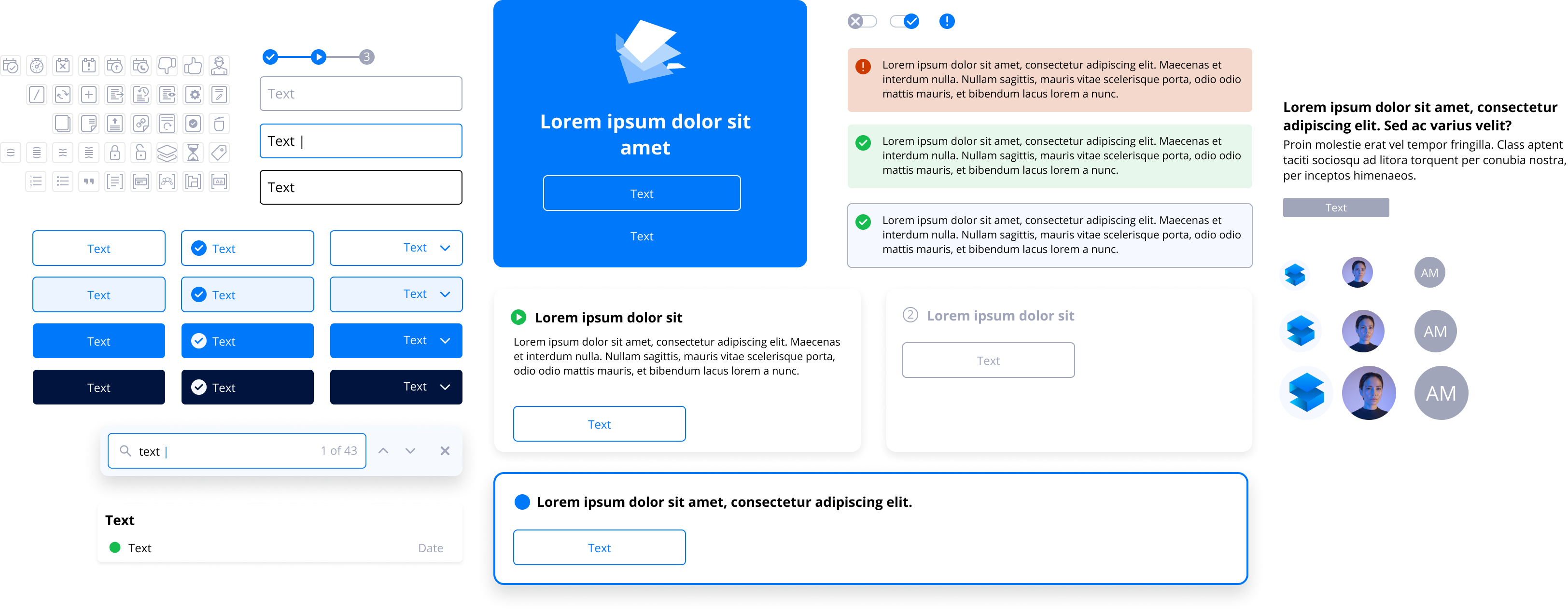
Initial explorations
Testing components during the construction of this design system was a critical phase to ensure reliability and maintain consistency. Rigorous testing involved both functional and visual assessments. Functionality testing verified that each component performs as expected, adhering to design specifications and interaction behaviours. Additionally, compatibility tests ensured that components work seamlessly across various browsers and devices.
Visual testing, on the other hand, ensures that the components align with the established design guidelines, including color schemes, typography, and spacing. Thoroughly evaluating components at each stage of development guarantees a robust design system that delivers a consistent and error-free user experience, fostering trust and reliability in Stacksi’s products.
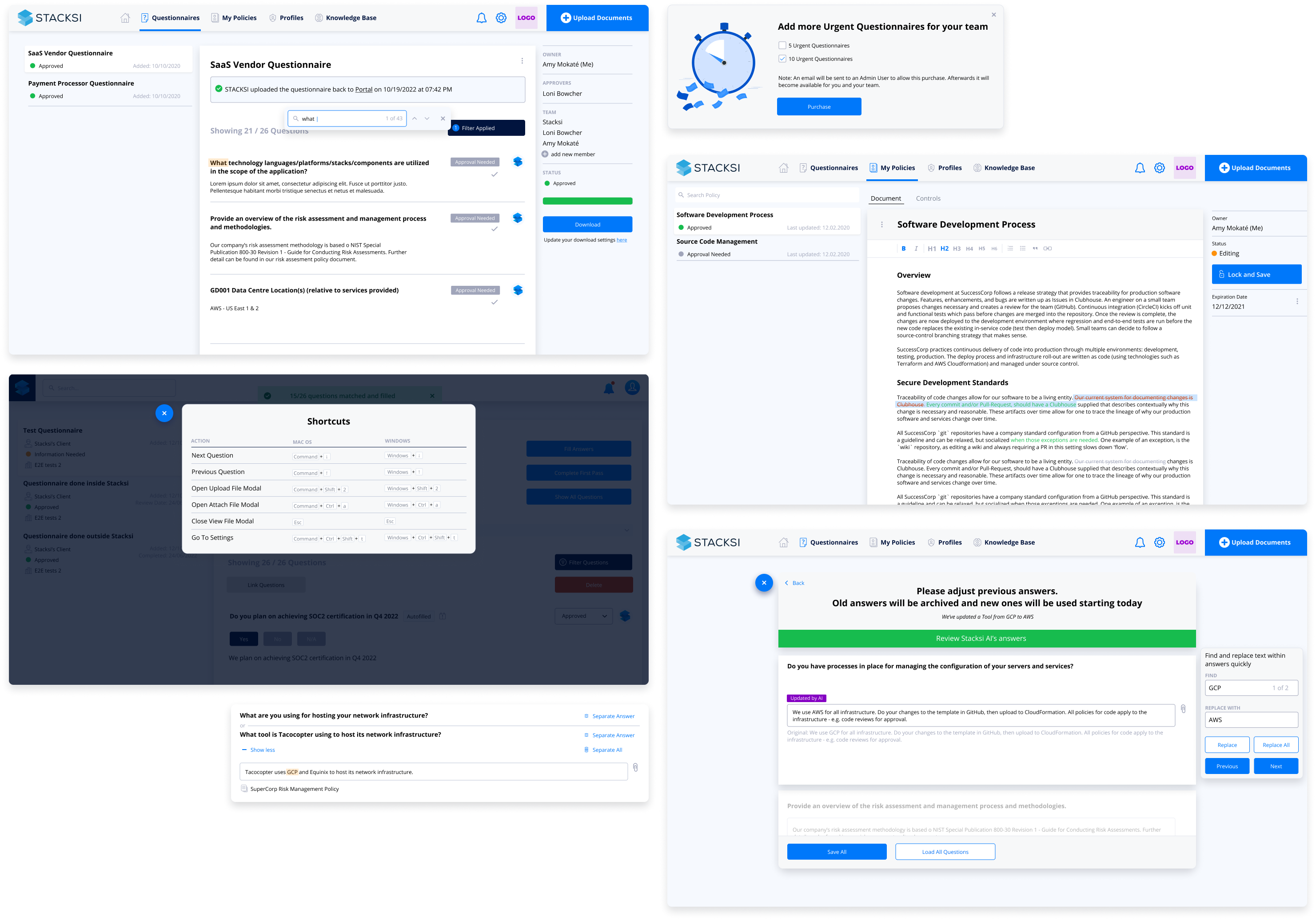
Results
Stacksi built its MVP in record time and was accepted into Y Combinator.
Five products and multiple features were developed and deployed in record time, while the customer base grew exponentially.